- AJ Products UK
- Blog: Tips to Inspire Happiness at work
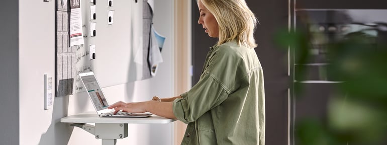
- Improving the work environment
- Decorate the office with the right colours
Decorate the office with the right colours
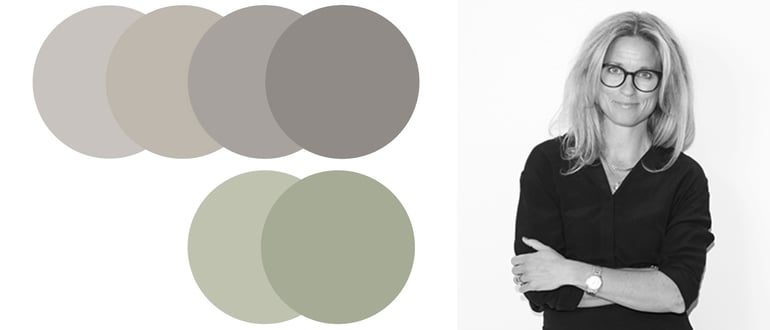
Warm gray NCS codes from left on the upper row: S 2002-Y, S 2502-Y, S 3502-Y, S 4502-Y
Colours tone-on-tone from left on the lower row: S 2010-G40Y, S 3010-G40Y
Which colours should you invest in to create a nice office where people want to be?
"Dirty pastels are nice for both wood, white and black office furniture. If you want to create a harmonious impression, the suggestion is to work with colours tone-on-tone. If you are looking for contrasts, use light colours together with darker ones."
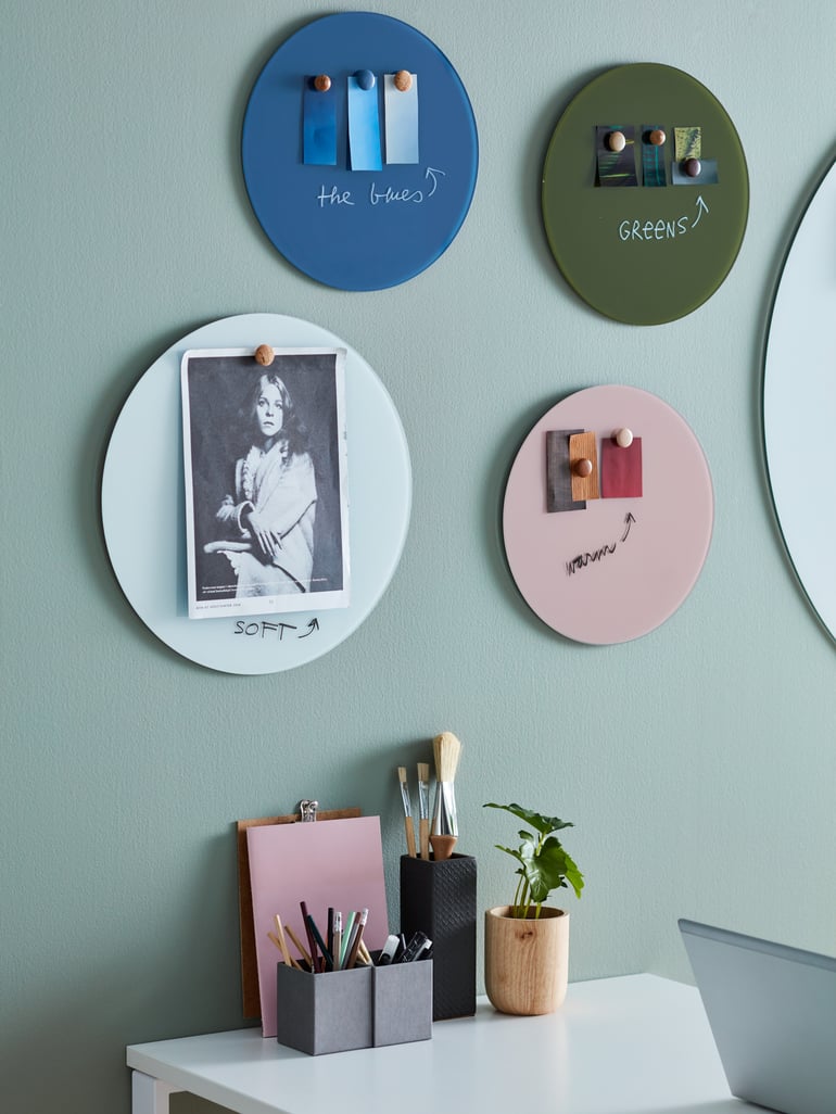
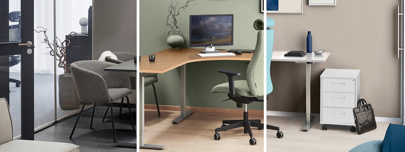
Choose the right colour for the right place
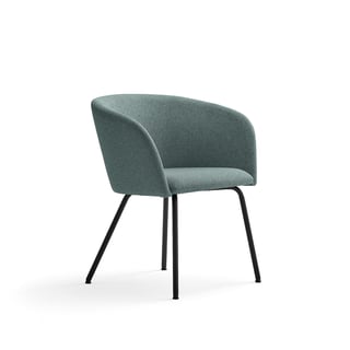
You can, for example, combine white and beige with blue. Blue is a calming colour that makes us more focused and creative. Purple also works well in an office environment as it balances rest and activity.Not many people think about the connection between colour and psychology, but colours can raise energy levels in the office and make us feel good and become more productive.
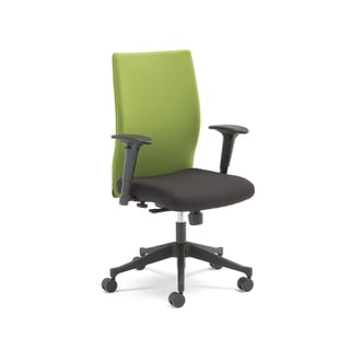
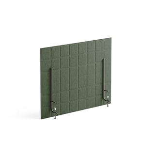
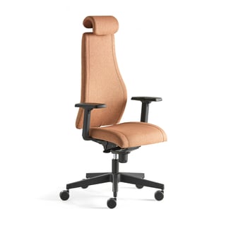
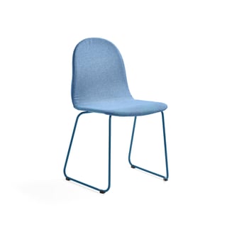
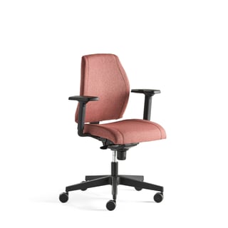
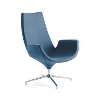
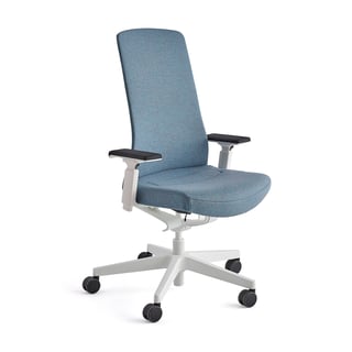
You've probably heard the expression: green is soothing. This also applies to interior design. Green is a stress-relieving colour and makes us feel safe and harmonious. Both blue and green are colours with positive energy and are a good choice when decorating a larger office space. Or why not choose a green or blue office chair instead of black or gray like most others do?
Green symbolizes nature, health, and environmental awareness. The colour suits all rooms, both large and small, as it creates balance and has a refreshing effect. According to feng shui, green represents nourishment and helps stabilize the body, both physically and emotionally.
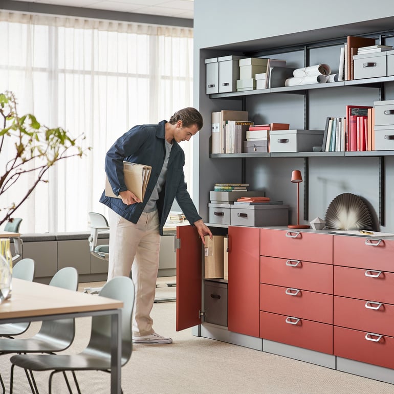
Dare to go bold with wall colour or invest in colourful details
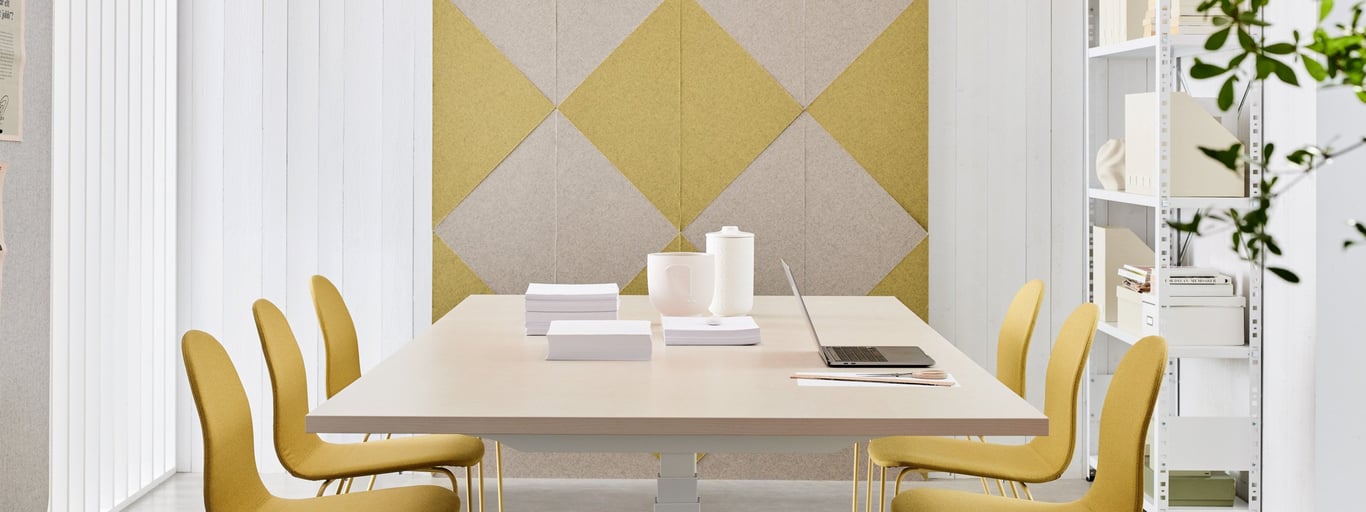
Yellow captures our attention and stimulates and activates the brain. If you want to create a creative meeting room, yellow is a safe bet, but beware of using the strong colour in an open office landscape. Not everyone likes it. If you are unlucky, the bright colour on the walls can become too sharp, instead of a lovely splash of colour. An alternative to yellow walls can be yellow wall absorbers, a sofa or whiteboard that cheers up without taking over.
“Strong and powerful colours, in general, take up a lot of space and create a harder expression. Instead, use them as an accent colour on, for example, textiles or fixtures, but avoid walls. ”
But before you dip the brush in the paint or buy new office furniture, it is important to talk to your employees.
“With the help of colour choices, you can influence the company and the company's profile. What signals do you want to send out to employees and visitors? How do you want to be perceived as a company? When creating office environments, it is important to look at the whole picture. You need to make sure that everything is connected and has a consistent thought in terms of colour, shape and material,” says Ulrika.
Combine colours for a harmonious workplace
FAQ
- The best colours for an office are those that enhance productivity and wellbeing, such as blue and green for calm and focus, and yellow for creativity.
- Colours like blue and green can increase focus and calm, while yellow stimulates creativity. Red can boost productivity but may also increase stress levels.
- Chalk white walls reflect up to 96% of light, which can cause eye strain, fatigue, and headaches. Warm grey tones are a better alternative as they are less reflective and create a more inviting atmosphere.
- Use bold colours as accent pieces in textiles, furniture, or fixtures rather than painting entire walls. This approach adds interest without overwhelming the workspace.
- Consider the impact on mood and productivity, employee preferences, and the overall company image. Ensure the colours complement the office furniture and decor for a cohesive look.